Monday, April 20, 2020

WK10 Submission 10 Best Process Images

WK10 Submission 10 Best Process Images 


I used this "theme" of lined writing paper and collage type layout in order to express my design process physically, as this is basically what my brain and workspace looks like realistically. But seriously, the choice in moving away from traditional grid layout that is clean and simple is to express my process work as a narrative and to tell a story that is sensory. The theme of lined paper is throughout all written submission in order to collate my work as well as have an artistic flare. 

LINK TO 3 MINUTE PRESENTATION: 

Monday, April 13, 2020

WK8 Materials and Photoshop


The image given in Fusion360 called 'Crossroads' was such a beautiful colour mixture of pinks and purples which created, what resembles, a sunset. I chose to use this as an underlay in my render of the CMP 3D piece.
Continuing, I left the lighting of the crossroads, and put gold metal on the outside of the piece (yellow is my favourite colour so it was an obvious choice) but gold also left the highlights in the curvature noticeable and prominent.


Furthermore, I changed the material to chrome black, which allows for the purple colour, which constrasts the yellow from the gold, depending on the angle, which is seen in the last image, which seems just solid black.

Background/Environment is 'Crossroads'


First photoshop of model materials and environment


Materials used for Photoshop 1
Dark wood horizontal cladding for exterior
White horizontal cladding for back wall
Grey paint for right wall
Shelf from original image of cardboard model
Wooden batten exposed sliding stacker door
Light natural timber flooring

I wanted to link to my degree, which is Interior Architecture, and change the materials of the interior, as well as the exterior. The choice of the background is to suit the openness of the room designed, as well as the full timber framed ceilings. The largest window on the back wall leads to the relaxed nature of the structure and leaves it bright and light, which is inspired by my choice of materials on the interior. The small wooden steps at the entry was to make the building seem like it belongs in that space, as well as lets the structure be suspended on stilts to create a deeper emotive sense when using the space.


Photoshop 2


Materials
Colourbond Matt Klip-lok profile finish.
White timber floor boards
Shelf and ceiling from original model
White paint for left wall
Large seamless fixed window

I wanted this version of the activity to be contrasted to my first photoshop. This is achieved by choices a exterior that allows for sight that is obvious, done by opposite colour to the landscape. The interior is all white, making the space calm and minimal.


Photoshop 3


Materials
Mid-tone brown brick wall
Glass white hinged stacked top hung door
white brick wall for right
existing shelving

This location is Level 2 of UNSW Quad. The brick wall is the existing colour of the wall, as well as the pavers on the ground. The blue columns on either side of the structure are also existing. The light is coming from the balcony on the right of the image, which casts a shadow of the space. The room, involves 4 chairs and a large table. The white inside gives a sense of pristine and a space perfect from peaceful study or snacking. The shelves can be decorated with fake plants (or real) in order to give a more energetic ambience.

Monday, April 6, 2020

WK7 light models, Fusion360 initials & transition space models


W7 Tutorial
Light models 
In this weeks tutorial activity I used one of my empty models in order to mimic the movement of light during the day to test how much light is created in the space, as well as how to overcome any over-use of shadow.


Natural Lighting 
Natural Lighting

Natural Lighting

Warm light to mimic sunset 


Top casted cool artificial lighting


Natural outdoor lighting casts a shadow of the ceiling into the room. This is what the room would look like when the sun is to the left of the space. Realistically thinking, during bad weather or at night, strip lighting would be places on the interior beams of the room. This was the second attempt on the roof, as the first attempt was a much more darker, cramped feeling that did not match the energy I was looking for in my ideal space. As seen in the photographs above, the beams from the ceiling create a really nice shadow that would be paired well with the mirrored feature wall.
How all my attempted models are linked
Ideally, all my models are to link together to create a large model that consist of a threshold/transition space which is the foyer, then to the stairs with a mezzanine level with a balcony. This continues with the large out-of-scale dining room. There is also a bedroom with a his and her walk in closet. Here are some images of the planned out, mis-matched model.


Light grey with white architectural ceiling is top cube, which leads to the brown cube with the mezzanine level, then up the stairs to the dining room with the glass tiled-like window ceiling. 


Fusion360 2.5d Transition Space 
The idea of the this transition space is to put a space that already exists into a 2.5d format.
The first opening is a garage, then moving into a hallway with 3 vertical windows on each side, and then a large room at the end. The ceilings change heights and this is as well as the rectangular prisms rotate, creating corners and turns.

The final 2.5d Fusion360 model assembled

All pieces laid out flat in Fusion360, till in 3d model form. 

Illustrator Laser Cut file. All my pieces didn't fit into one page so a second page is made. The lines are very fine, but they are there. 
Fusion360 3d initials 
The letters for this design are C, M and P. The 'C' resembles a crescent moon, in an attempt to make my lettering and font style different and unique. The 'M' is simple and matches the curvature of the C. In my last letter, the letter P had many problems in the making of it, with many failures of creating the loft in the piece, as well as lines and faces intersecting, according to the program. The end result I am really proud of, and I would consider actually 3D printing it.


side curvature of the shape 


Monday, March 30, 2020

WK06 Fusion 360 2.5d and more models

WK06 Fusion 360 attempt

Three Rectangular Prisms transition space attempt 1
 
FRONT


BACK


Flat pack, no tongue and groove edges without ceilings


All 3 prisms

First prism

Second Prism


Third Prism


FINISHED:
Front

Back

Laying the 3d pieces flat ready to turn into a layout sketch
After turned to layout sketch, the pieces are put into illustrator and ready to be laser cut. There are 2 pages for the layout as I couldn't fit all the pieces on one sheet. Only three pieces are on the second sheet. 


Model
Original 1:20 scale, although now a different scale once second level was introduced (so 1:40 now)


Top View, Level 2 bedroom, his&her walk-in robe, balcony, sliding door and bed


Level 2 bedroom, balcony, bed, sliding door


Downstairs ceiling fan/accordion industrial ceiling

downstairs front entry, industrial foyer ceiling architecture

Tuesday, March 24, 2020

WK05 Models


First Model: Dining Room 
Scale: 1:10 
Material: Paper, all folded no glue. 
What it's showing: 3 walled open space, large window on back wall, exposed beam on face (cut off sorry) 

Second Model: Dining Room
Scale: 1:20 
Material: Cereal Box, using tabs and glue
What it's showing: 3 walled open space, large window on back wall, exposed beam on face


Third Model: Playing around
Scale: 1:20
Material: Cardboard boxes and sticky tape
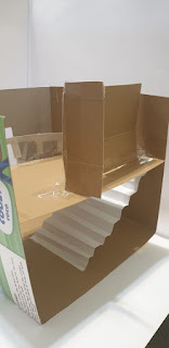
What it's showing: open walled and ceiling model (supposed to be closed), staircase made of alternating folds in paper, mezzanine/ loft or second level include a small room just off the stairs as well as a void/indoor balcony to the downstairs.


I found that cardboard was easier to use, only because it was solid enough to stand by itself. The only issue is that cardboard is hard find for large measurements, but is very easy to cut and stick together. The ultimate goals was the have all 3 walls and the floor to be the same piece of cardboard to make the form stronger. Although this was overcome by using sticky tape to hold the missing wall, which also gave the advantage of a different colour which brings dimension, in my opinion, to the model. I tried to follow what my transition space in my house is like, however it isn't exactly correct. Also, if I was to make it correct to the 1:20 scale, the ceilings would have to be adjusted, although including a loft the 3.1m ceilings is perfect.

The only issue with using paper, is that it doesn't stand and loses its shape very fast. I've also crushed a lot of my models because paper can't hold itself when cardboard is put on top.

I also attempted the paper folding techniques from the videos Kate and Russel Set during the online tutorial, which gave me the idea for another model which will be in next weeks blog. As im studying interior architecture, I was thinking was doing a feature wall, or a feature ceiling, which is taken from the pinterest board sent by Kate/Russell as well as Danielah.

This are my inspiration images for next week:

.                               


Saturday, March 14, 2020

Final Submissions


Photoshop:

Original idea was to have all images link together. For example, between mine and Riley's on the right. Both images were taken at the same place, and even have the same tree in the image. To link seamlessly, the tree was suppose to merge into my drawing. This can be done by using perspective warp or distortion. However, the group decided to do individual spots and to put them together this.

Infographic:


Agreed colour theme, all include gradient and same background colour


Site Map/Floor Plan:


Used the same colour swatched. Linked all together with a singular line in order to show cohesion

Composite of Analogue and Digital Drawings:

Composite Drawings and Digital WK04

Hand drawing used from Wk 01 and Pedestrian Movement floor plan from Wk03


Used photoshop to darken image and make sharper in order for the pencil lines to be able to be seen. Also used the magic wand tool and the eraser to make transparent. Lowered the flow and opacity of the eraser tool towards the edges to make it fade.

Added blue lines using pen tool, selected the type of stroke I wanted, and matched the colour to the original floor plan colours. Lowered the opacity and rotated the floor plan, lowering the opacity made a great effect and also highlighted the sketch.
Blue perspective lines where added to create dimension and artistic effect.

Finished Work:
 

Submitted Group Piece: