Monday, March 30, 2020

WK06 Fusion 360 2.5d and more models

WK06 Fusion 360 attempt

Three Rectangular Prisms transition space attempt 1
 
FRONT


BACK


Flat pack, no tongue and groove edges without ceilings


All 3 prisms

First prism

Second Prism


Third Prism


FINISHED:
Front

Back

Laying the 3d pieces flat ready to turn into a layout sketch
After turned to layout sketch, the pieces are put into illustrator and ready to be laser cut. There are 2 pages for the layout as I couldn't fit all the pieces on one sheet. Only three pieces are on the second sheet. 


Model
Original 1:20 scale, although now a different scale once second level was introduced (so 1:40 now)


Top View, Level 2 bedroom, his&her walk-in robe, balcony, sliding door and bed


Level 2 bedroom, balcony, bed, sliding door


Downstairs ceiling fan/accordion industrial ceiling

downstairs front entry, industrial foyer ceiling architecture

Tuesday, March 24, 2020

WK05 Models


First Model: Dining Room 
Scale: 1:10 
Material: Paper, all folded no glue. 
What it's showing: 3 walled open space, large window on back wall, exposed beam on face (cut off sorry) 

Second Model: Dining Room
Scale: 1:20 
Material: Cereal Box, using tabs and glue
What it's showing: 3 walled open space, large window on back wall, exposed beam on face


Third Model: Playing around
Scale: 1:20
Material: Cardboard boxes and sticky tape
What it's showing: open walled and ceiling model (supposed to be closed), staircase made of alternating folds in paper, mezzanine/ loft or second level include a small room just off the stairs as well as a void/indoor balcony to the downstairs.
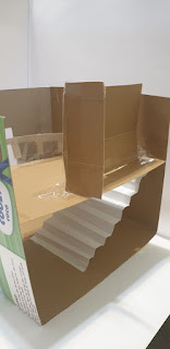


I found that cardboard was easier to use, only because it was solid enough to stand by itself. The only issue is that cardboard is hard find for large measurements, but is very easy to cut and stick together. The ultimate goals was the have all 3 walls and the floor to be the same piece of cardboard to make the form stronger. Although this was overcome by using sticky tape to hold the missing wall, which also gave the advantage of a different colour which brings dimension, in my opinion, to the model. I tried to follow what my transition space in my house is like, however it isn't exactly correct. Also, if I was to make it correct to the 1:20 scale, the ceilings would have to be adjusted, although including a loft the 3.1m ceilings is perfect.

The only issue with using paper, is that it doesn't stand and loses its shape very fast. I've also crushed a lot of my models because paper can't hold itself when cardboard is put on top.

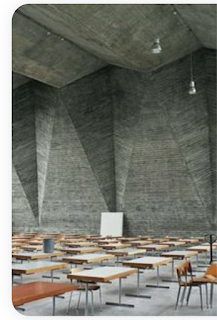
I also attempted the paper folding techniques from the videos Kate and Russel Set during the online tutorial, which gave me the idea for another model which will be in next weeks blog. As im studying interior architecture, I was thinking was doing a feature wall, or a feature ceiling, which is taken from the pinterest board sent by Kate/Russell as well as Danielah.

This are my inspiration images for next week:
.                               


Saturday, March 14, 2020

Final Submissions


Photoshop:

Original idea was to have all images link together. For example, between mine and Riley's on the right. Both images were taken at the same place, and even have the same tree in the image. To link seamlessly, the tree was suppose to merge into my drawing. This can be done by using perspective warp or distortion. However, the group decided to do individual spots and to put them together this.

Infographic:


Agreed colour theme, all include gradient and same background colour


Site Map/Floor Plan:


Used the same colour swatched. Linked all together with a singular line in order to show cohesion

Composite of Analogue and Digital Drawings:

Composite Drawings and Digital WK04

Hand drawing used from Wk 01 and Pedestrian Movement floor plan from Wk03


Used photoshop to darken image and make sharper in order for the pencil lines to be able to be seen. Also used the magic wand tool and the eraser to make transparent. Lowered the flow and opacity of the eraser tool towards the edges to make it fade.

Added blue lines using pen tool, selected the type of stroke I wanted, and matched the colour to the original floor plan colours. Lowered the opacity and rotated the floor plan, lowering the opacity made a great effect and also highlighted the sketch.
Blue perspective lines where added to create dimension and artistic effect.

Finished Work:
 

Submitted Group Piece:

Pedestrian Movement, Plan of Site WK03


Scan floor plan of site: 
My drawing of the site to 1:200 scale. The green area showing my boundary. 

Click link to open Pedestrian Movement Video


Illustration of site from illustrator without pedestrian movement (pedestrian movement to be added in final collection in order to sync all works together)


SCALE and COLOUR CHANGED in order to match up with the rest of the group.


- Colour inspiration has been taken from this instagram photo @artofmapping


Submitted Work:


Each section has the persons name on it. When trying to find how each map links to each other follow the placement. So for example, Christine's goes on top of Jeremy's which is on top of Riley's which goes to the right of Luka's, which is on the bottom of Sienna's.

Colour Swatches WK02

BENV1010                                                                                                                  Christine Pazpinis

Studio Activities WK02:

Colour Swatches
Data Title: Food on Campus


Image:                                                             Word:                      Swatches:                                       


Inflated


Harmonies:


Multicultural


Convenient


Site Swatches, Harmonies and Image